Blog
Google is Rewarding Mobile SEO Efforts.

Mobile SEO is recently a very popular subject and for many good reasons.
More and more people are shopping on their mobile devices. It’s fast, it’s easy, and it allows you to multitask. Buying the dream dress, while getting a haircut, or booking your next holiday, while being stuck on the train with your face in someone else’s armpit has never been easier.
The numbers of mobile searches are growing year after year, and it’s no longer acceptable for any reputable business to ignore it.
So it only makes sense that the businesses that made the greatest amount of effort in optimizing their websites for mobile users are now being rewarded in the google ranking game. If you’re worried that you may be too late in this game, it appears there is some good news. Google will most likely reprocess new mobile-friendly pages quickly, within 72-hours from the changes being applied.
So the latest google algorithm, launched on the 21st of April, referred to by many SEO experts and webmasters as #mobilegeddon, did not take us by surprise at DEP. It was a long time coming, and we’ve been recommending getting mobile friendly sites launched by our clients for over five years.
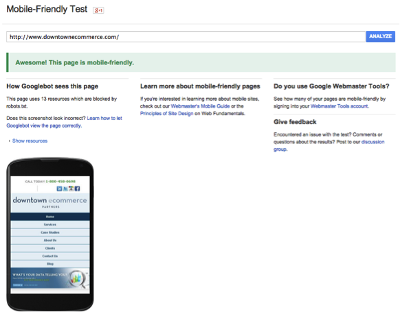
If you are not 100% sure if your site needs a mobile update, Google offers this handy tool to determine whether your site is currently seen as optimized for mobile or it needs some work done:
You’ll get a small ranking boost in the search engines over sites that are not mobile friendly, on mobile searches. All your pages, including your blog, should be optimized, not only your home page. If done correctly, you have nothing to worry about.
How do you qualify to show a mobile friendly label for your web pages?
Google said it recommends the following criteria:
- Avoid software that is not common on mobile devices, like Flash.
- Uses text that is readable without zooming.
- Sizes content to the screen so users don’t have to scroll horizontally or zoom, design it for ‘the fat finger’.
- Places links far enough apart so that the correct one can be easily tapped.
- Don’t use pop-ups either, It can be difficult and frustrating to try and close these on a mobile device. This might lead to a high bounce rate.
Soon, you can say goodbye to seeing URLs when searching your mobile phone. On April 17th, Google announced its plan to replace the once-standard domain name with the real name of the website on all mobile searches. This update will give mobile searchers the ability to understand what a site is about more quickly, even before clicking to open its contents.
In the future, as mobile trends and technologies evolve, the algorithm is likely to evolve and change again. We can already predict, that the next logical step would be to get your mobile version of the site up to speed, to ensure quicker loading time for better user experience.
If you have any questions in regards to updating your mobile version of the site, or would like to know more about the impact it may have on your rankings, please email or call us, and we will be happy to give you some answers.
This post was written by downtownecommerce_admin